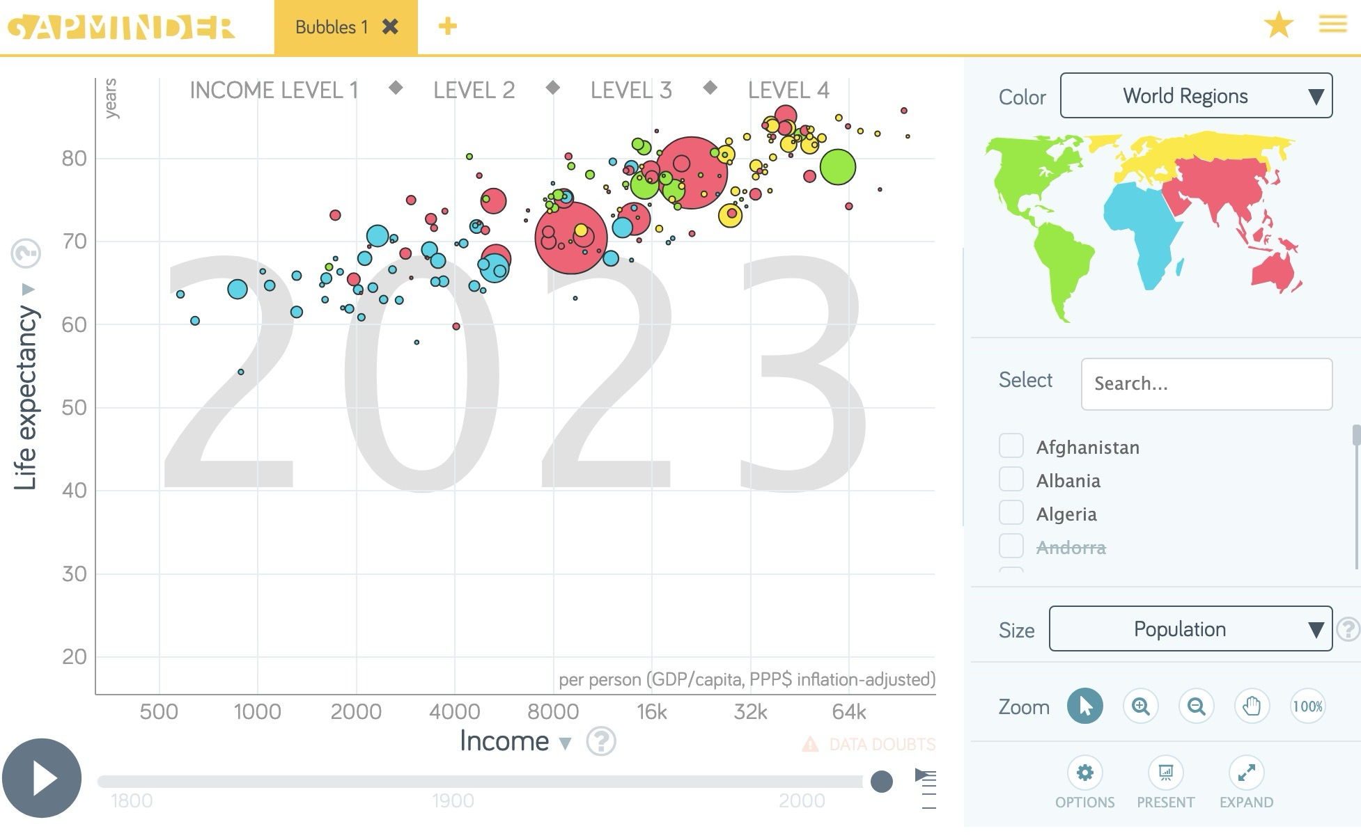
This time I will write on my first impression about a gorgeous teaching tool that I have discovered thanks to a TED video by Hans Rosling: Gapminder.

Gapminder is a web site that allows dynamic presentation of many interesting time series (economic indicators, demographics, education, technology). It is also possible to download an off-line version made with Adobe Air.
It is very straightforward to use (just click to select the data to show on both axes, for the size of the bubbles and the categorization (geographic regions, countries, etc.) for the coloring of the points. You can animate the evolution of the variables in time and show very lively graphs to your students.
In my courses on economic growth, I generally confront theories with empirics and this tool will give me much better speaking graphs.
Unfortunately, there is no way to include your data in the tool and the real utility of it will finally depend on the data sets you need. But GapMinder web site is kind enough to show how to animate your data using Google Motion Chart. I was not aware of the existence of this tool…